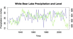
Ok, my previous graph was ugly & slightly wrong so I'm going to put up an updated version. The units are better and so it should be a better visualization. Blue is for water falling from the sky and green is for lake level.
You can see much more easily here how lake level and annual precipitation tracked pretty closely for many years, but since about 2003 they have decoupled. The USGS has a report discussing the analysis that went into showing this scientifically, but you can see it here too!
Worksheet soon... digesting Thanksgiving leftovers still...

