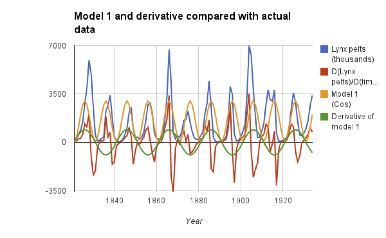
As promised, a return to lynx. In my previous post about lynx I posted a worksheet modeling lynx populations with a cosine function, and mentioned that this is not the best model. Look at the derivative to see how bad it is -- the green and red lines ought to be matching up:
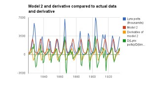
Graphing the log of the lynx data gives a transformed graph that is much more sinusoidal! The better model for the lynx data, then, is exp(something sinusoidal). Look at the graph below to compare Model 2 and its derivative to the data. The green and yellow curves are much more alike:
This worksheet guides students to developing this model after having them evaluate the previous sinusoidal model via technology.
The worksheet I'll include below is meant for a day when you have computer lab time with students. I know that this does not include everyone... but if you can head down to the lab for such an activity, there is a lot students can learn!
This worksheet applies knowledge of:
- the chain rule, on compositions of trigonometric and exponential functions
- numerical approximation of the derivative
- shapes of graphs.
Along the way students must evaluate models and create one of their own.
As the instructor, you'll have to decide what software you want to use for this activity. I have had success using Excel, asking every student to email me their work on the way out of the lab, and these days you can use Google Drive if your institution uses Gmail. If you and your students are already quite familiar with R you could also use that. Beware of differences between Mac Excel and Windows Excel, especially in graphing -- work through the activity yourself on whatever platform students will use.


